Turning Data into Stories: Analyzing Attendance in Head Start with R
This guest post is written by Social Impact Researcher and Data Specialist Aleksandr Pugachev. Follow his writing here.
Says Mr. Pugachev, "This post illustrates the application of various analytical techniques in R (a free, open-source programming language primarily used for statistical computing and data visualization) for exploring program data, with a specific focus on three key steps: data manipulation, visualization, and narrative development. The example used discusses attendance case from the Head Start program."
Note: We recommend using GoEngage's 7 interactive Attendance dashboards in Program Outcomes Portal (POP) to complement the strategies discussed in Mr. Pugachev's article.
—
Turning Data into Stories: Analyzing Attendance in Head Start with R
Link to original article: https://medium.com/head-start-data-analysis/program-analysis-head-start-attendance-case-394f693ba157
The objective of this project is to demonstrate how to apply various analytical techniques using R software to explore the Head Start (HS) program data.
After reading this post, you will be able to:
Gain an understanding of how to create various types of bar and area charts using ggplot2.
Interpret the findings of visuals and develop narratives about your data based on observations.
Propose recommendations and further steps to improve the program based on the insights derived from the data analysis.
Before exploring a practical example of attendance case, it is essential to highlight several significant aspects of the data and establish connections with the program. The collected data from beneficiaries plays a crucial role in making program decisions. It serves as evidence as to how interventions impact the targeted groups. Without data analysis, the management team lacks insights into areas that require improvement. It’s essential to note that the evidence of impact on the target group is unlike to emerge directly from raw data. Prior to transforming data into meaningful information, it should undergo cleaning, summarizing, and analysis.
For this specific example, I will explore the attendance of HS program. To accomplish my objective, there will be three steps performed: data manipulation, visualization, and narrative development. These steps are essential for anyone who desires to develop a solid story about the examined data.
— Data manipulation is the processing of familiarization oneself with data. This process includes: (1) identifying missing data, (2) finding unusual patterns or outliers and (3) shaping data in the appropriate format before analysis.
— Visualization is an image message to the audience. Presenting mere facts can be boring. Therefore, it is crucial to consider various ways of presenting analysis findings using charts, diagrams, or pictures. This approach enhances the likelihood that the audience will remember key points as well as make the story more interesting.
— Narrative development is the interpretation of analyzed data. This part synthesizes complex analysis into an understandable and actionable plan for program improvements. The developed recommendations have to be clear, specific, and doable. All interested parties should reach an agreement on recommendations in order to prevent resistance on their subsequent implementation.
When it comes to program analysis, some believe that including as many variables as possible is the best approach. However, this is not always the case. Sometimes, it is more useful to begin by examining a few variables. The logic here is to start the analysis from simpler elements and then progress to a more comprehensive analysis. It is worthwhile to mention that a comprehensive analysis requires more time and human expertise. Therefore, by addressing smaller aspects in the program, you are likely to introduce incremental changes that can eventually have a positive impact on the entire program. The practical example described below is a compelling demonstration of how exploring just two variables (date and absence reasons) can lead to the development of a comprehensive attendance story.
Analysis of Absences Types
This example examines the types of absences in classes, which is a subject of interest for both the management team and education staff. This data is routinely collected by teachers or family advocates with the help of a web-based management system. It tracks detailed information on the reasons for a child’s absence from class and allows generating various monitoring reports.
If HS utilizes GoEngage, relevant data can be found in the ‘Average Enrolled Attendance Absent Reason’ report. While the report may contain multiple variables, for this specific example, only two are used: the date and the reason for absence. When excluding other variables from the report, the output will result in resembling the screenshot below.
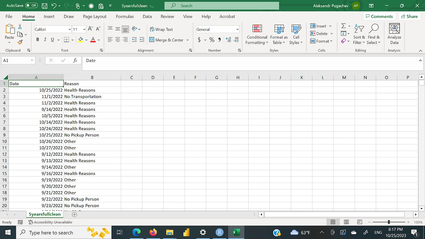
The report has data for a six year period, from 2017 to 2022, detailing various reasons for absences.
Using R software, some data manipulations will be performed. To begin, the first variable ‘date’ can be split into month, date, and year. This task is simplified by utilizing the ‘lubridate’ package. Subsequently, data can be summarized by month and reason, allowing for a comprehensive examination of trends across the specified years.
Code to get data in the right format:
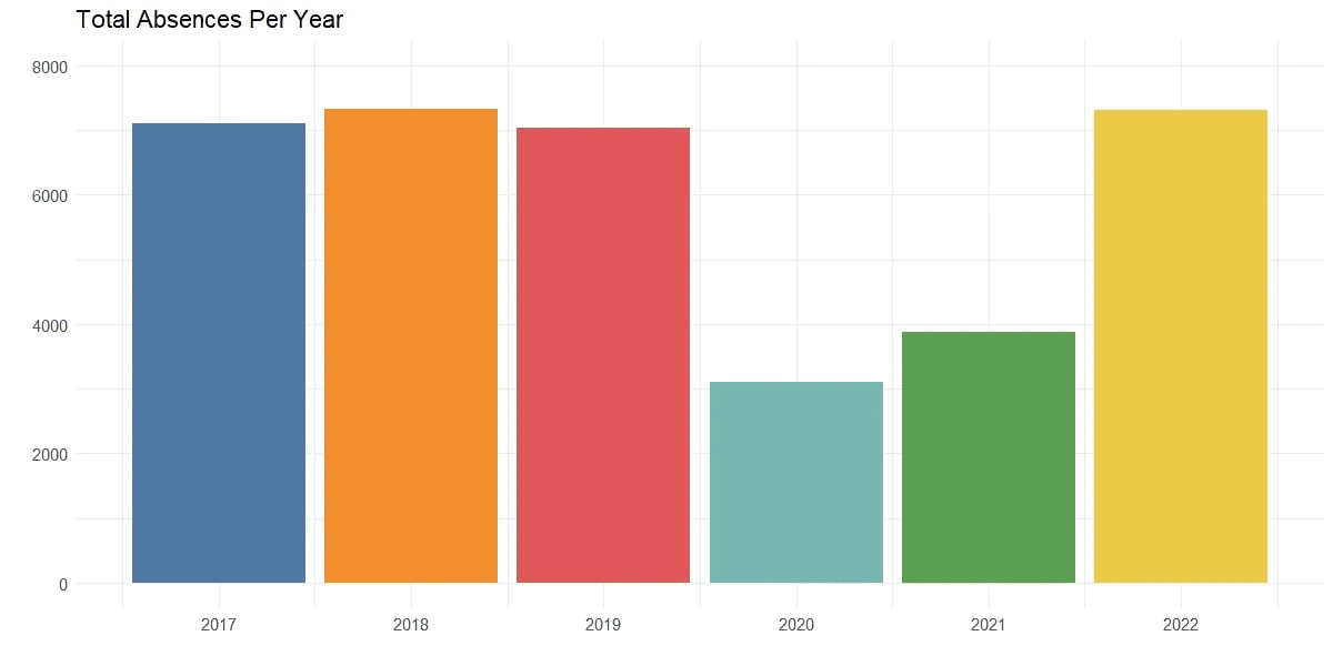
After grouping data, the next step is to obtain a general understanding of the absences. Therefore, it becomes clear to address two essential questions: (1) How many absences are recorded per year? (2) Does the number of absences look the same across the years?
The bar chart can be viewed as an easy and straightforward presentation of the total number of absences recorded in the program across different years.
Code to create bar chart that shows total number of absences per year:
Output of the code:
Observations:
In the years 2017, 2018, 2019, and 2022, the annual number of absences consistently exceeded 7000. The deviation occurs in the years 2020 and 2021. This can be explained by the onset of the COVID-19 pandemic in March 2020. The HS program faced temporary closure due to lockdown measures lasting until the end of program year. Subsequently, in 2021, the program transitioned to an online format. This resulted in a decrease of total children enrollment by half during these two program years. Therefore, it makes sense to observe a deviation in these years given the unique circumstances.
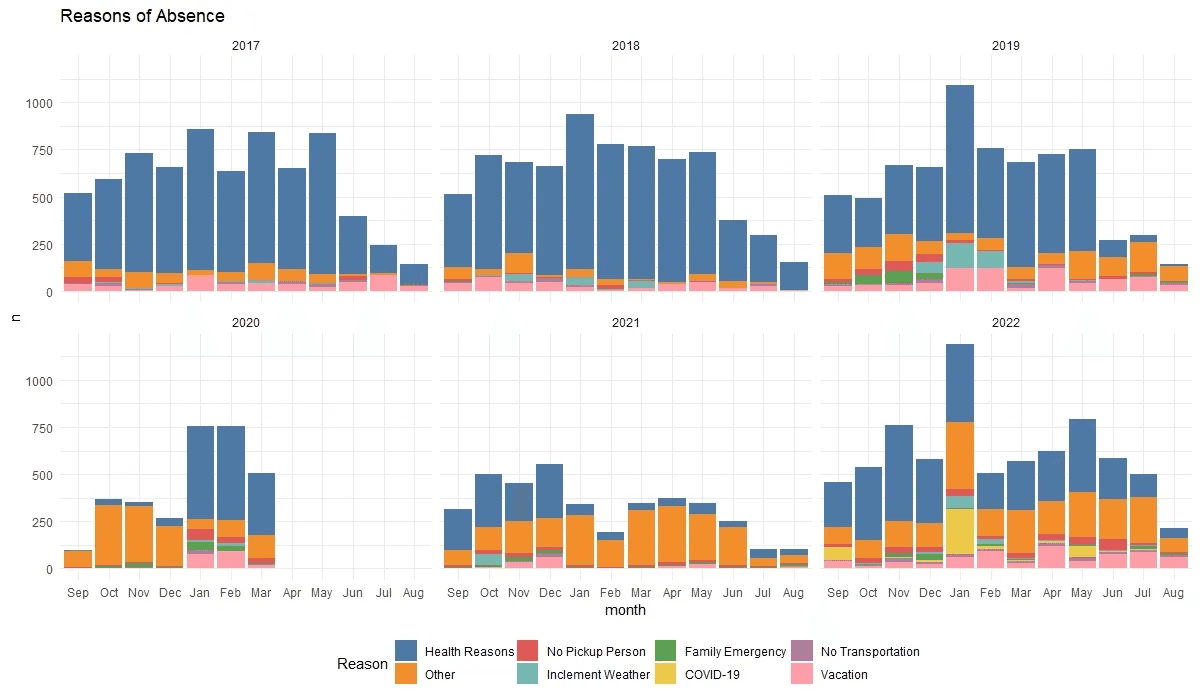
After visualizing the total number of absences, it can be useful to obtain additional insights by adding month and reasons to the bar chart. This will help to explore two questions: (1) How does the number of absences vary across months and years? (2) What type of absences prevails in each month and is this similar across the years?
Code to create bar chart that shows reasons of absences by months across years:
Output of the code:
Observations:
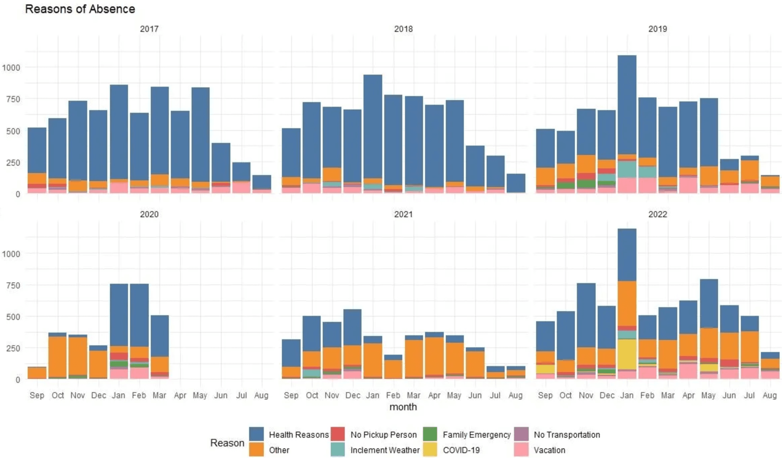
The chart illustrates reasons for teacher-recorded absences, categorized by month and year. The data for the year 2020 extends only until March, reflecting a period of adjustment due to COVID-related disruptions. This type of data was not collected by teachers from April through August in 2020.
From the chart, the significant presence of health-related reasons can be noted throughout each month. This suggests a persistent occurrence of children’s illnesses, although it is difficult to associate it with a specific time period, such as winter versus summer. While it’s challenging to pinpoint a distinct period of absenteeism throughout the year, the month of January consistently stands out with the highest numbers across multiple years.
Additionally, another pattern emerges when comparing the years 2020, 2021, and 2022. The trend of health-related absences is decreasing over these years, while the category labeled as “other” is increasing. In contrast, the rest of the categories appear relatively steady across the observed years.
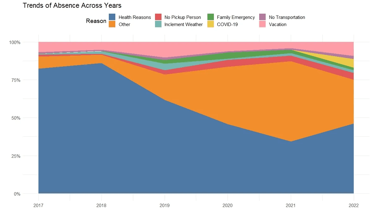
From the previous chart, it is obvious that two reasons stand out: “health” and “other” vs all the rest. As the chart illustrates frequencies, it can be useful to present percentages and compare how all categories evolve over the years. For this purpose, the stacked area chart can be handy.
Code to create stacked area chart:
Output of the code:
Observations:
The chart presents the decline in health reasons over the years from over 75% in 2017 to around 50% in 2019. While health reasons are in decline, another category “other” is steadily growing.
The potential explanation for the rise of the “other” category can be a data recording issue. It seems that “other” was used when the teachers failed to obtain the true reason for the child’s absence. This lack of specificity in the “other” category poses a challenge in interpreting and addressing the true reasons behind absences.
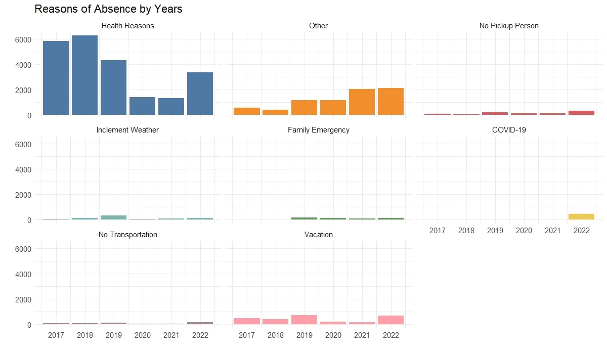
The created stacked area chart effectively illustrates the general trend but is not useful for understanding categories with small percentages. It seems reasonable to create a separate simple bar chart to track the frequency of specific reasons (such as no pickup person, transportation issues, family emergencies, vacations, etc.) This can provide a clearer understanding of changes in these specific categories over time.
Code to create simple bar chart by reasons and years:
Output of the code:
Observations:
From the chart, it can be concluded that there is no significant fluctuation in data for categories such as “no pickup person”, “no transportation,” “vacation,” “COVID-19,” “inclement weather” and “family emergency”. The numbers remain almost constant over the years. This reaffirms the observation from the previous stacked area chart that the two categories undergoing changes are “health reasons” and “other.”
Summary of analysis:
To understand the reasons for class absenteeism, the variables of date and absence reasons are analyzed. The time period covers six years, from 2017 to 2022. The first chart illustrates the total number of absences per year. The observation reveals minimal variation across the years, with 2017, 2018, 2019, and 2022 showing similar numbers. On the contrary, the years 2020 and 2021 stand out from the rest due to the impact of the COVID-19 pandemic. The HS program was temporarily closed and later transitioned from an in-person to an online format. This led to a decline in enrollment and subsequent changes in absence numbers
When exploring reasons for absences grouped by months and reasons across years, health-related issues dominate over the rest. The second most prevalent reason is “other”, which experienced an increase during the pandemic period. This can be explained by the change in program format from in-person to online. It is likely that teachers used the “other” category when children were not physically present in the classroom and when they failed to obtain an explanation of absence from parents.
Recommendations:
1. Health Team Collaboration:
- Collaborate with the health team to explore potential actions that could be helpful in addressing health-related absenteeism.
- Consider initiatives such as reminding families about flu vaccinations and other health-related measures.
-Consider collecting additional information through case notes completed by teachers/family advocates about health reasons.
2. Parent-Teacher Conferences (PTC):
- During PTC, teachers should address the health topic and encourage open discussions with parents.
- Explore the possibility of arranging workshops with the health team engaging parents where they can ask questions and discuss the health of their children.
3. Investigate “Other” Category Usage:
- Address the situation with teachers regarding the use of the “other” category for absences.
- Investigate the reasons behind the use of “other” and work towards establishing a more specific and standardized term to avoid ambiguity in the future.
This action plan can foster collaboration among the health team, teachers, and parents, and consequently, propose a proactive approach to deal with absenteeism issues.
—
Author Bio

Aleksandr Pugachev is a results-oriented social impact researcher with extensive experience in both qualitative and quantitative methodologies. His career has been dedicated to advancing global initiatives in education, public health, gender equity, and community development. With expertise in data collection, validation, and analysis, he specializes in transforming complex datasets into actionable insights that drive meaningful change.
As the Data Manager for the Community Action Agency of Somerville, MA, Aleksandr oversees the organization’s database systems. He ensures data integrity, designs evaluation metrics, and generates reports to track program success. In recent years, he has focused on empowering the Head Start team to better understand and utilize data, leading to significant program improvements.
Mr. Pugachev is looking to connect with others interested in community-focused data analysis and to build a network of individuals passionate about using data to create positive impact. We invite you to follow him on Medium.

Aleksandr Pugachev is a results-oriented social impact researcher with extensive experience in both qualitative and quantitative methodologies. Follow him on Medium.

